on my last post i had the following unresolved problem;
  • making on hover change images in css took a little bit of figuring out but in the end i have chosen to go with a method that hides the top image to reveal the hidden on on hover. this gives the required look but currently its quite difficult to use the buttons so i will need to find out why and if there is a way i can fix this.
  • making the hover buttons each a separate div knocked them out of line so i had to line them up.
  • my site looks bad bad bad on firefox or ie so i need to do something about that!
in order to stop this problem i have used sprites, basically one large image which moves position depending on variables set in the css. so far there are 2 sprites in use on my website these are on my top navigation and left and right navigation buttons. having it in these locations allows me to add details to my website that help give it a polished feel examples of this are; having the pages you are not currently on greyed out and not displaying the right and left arrow if there is not a previous or next page.

here are some of the problems i have had since then and my solutions.

  • i wanted to have my current page number display as a blue. to achive this i took the code from my sprites where it shows the current state
    #body_principles li#nav_principles a
    the key part of this code i took was the body id. using the body id and giving each of my page links an id i was able to create the code to display the connected page number with the number page that is being displayed. however this has given me a large amount of code and was quite time consuming but now that it is done i can just copy and paste it where needed. the large number of pages present in my site also meant that i had to have several css styles doing the same thing but for different body id's so that it would not clash with my other sprites which use body id's. the code i ended up with looks like this
    #body_2 subpagenav #two { font-family: Verdana; font-size: 12; font-weight: bold; color: #0099cc;}
    with the body id and link id changing where needed.
  • I wanted to add a scroll bar to my box but when i used overflow: scroll; it gave me a scroll bad on the bottom of the box which would be greyed out because it would not be in use. to solve this i used overflow-x and -y which meant i could turn off the bottom bar. this dose mean that i will probably need to change this for IE6 as its a css3 code.
  • my glossary sits outside of the wrap which gave me lots of problems when trying to line it up, this was because i had the wrap center the page with auto margins. the effect of this was that when viewed of different resolutions (thanks duel monitor for letting me spot this). to solve this problem i had to change the way i centred my page. i came across this method by accident while looking for how to place things out side the wrap.
    http://bluerobot.com/web/css/center2.html
    from experimenting with the code before searching trying to fix it i identified that it was the auto margin that was the problem so when saw this centring method i realised i could use it to give my glossary precise positions regardless of resolution. i did this by applying the method to my wrap, then i applied the same to the glossary div and instead of using a negative margin to center it i used a positive one slightly over 1/2 the width of my wrap so that it would sit just to the right of it. one problem i have found with this is that when you use the scaling functions they main box and glossary text box are put out of line because they both positioned relatively i will try giving them fixed positioning to solve this but it is not a major issue.
  • an easy problem to solve but one that wasted lots of time was when i backed up my style sheet with a save as then didn't revert to the original after which meant any changes i made had no effect. to stop this happening again i always make sure that i am working on the right document.
so i know that i will have several problems which need solving/fixing as i go through the project. i will note down the ones i encounter during this current working session.

  • when creating navigation between my pages i forgot about removing the ../ and html/ at the start of my paths which broke links once i had used find and replace. to fix this i just did a quick find and replace and removed the needed parts.
  • making on hover change images in css took a little bit of figuring out but in the end i have chosen to go with a method that hides the top image to reveal the hidden on on hover. this gives the required look but currently its quite difficult to use the buttons so i will need to find out why and if there is a way i can fix this.
  • making the hover buttons each a separate div knocked them out of line so i had to line them up.
  • my site looks bad bad bad on firefox or ie so i need to do something about that!
below is a mock-up of my webpage. in our presentations i was advised that the blue colour should be visible throughout more of the site and that the scribble in from on animation could be a balloon. it was also stated that my scroll bad should be above the navigation buttons at the bottom of the text content so that you don't have to scroll to see them. i thought that the text area should have its hight reduced to lengthen the website.
(click image for larger version)
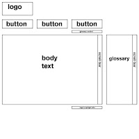
i have developed the layout in my sketch book and this is the wireframe that i have come up with. it is based on a 3 column grid that will be centred then a 4th column for the glossary which can be switched on and off but will default to off.
(click image for full size version)


because i am going to produce a website that will be viewed on multiple screens i need to make sure my website will fit on all screen resolutions without a horizontal scroll bar.
w3 school says that only 1% of the market used a screen resolution lower than 1024x768 in 2009
w3 counter says that in the month of january 2010 3.51% used a resolution lower than 1024x768 (source: http://www.w3counter.com/globalstats.php)

with such a small % of the market using lower than 1024x768 i think it will be safe for me to base my website around 900 horizontal pixels. with the morority of the content 50pixels away from the sides.
i have done research some research into animation and i came up with a list a topics that my website should have a page about in my sketch book. i then applied the SHE principle from John Meada's laws of simplicity and reduced it to 3 pages, using techniques that i have seen on websites, while researching, to hide a large amount of information until needed. as a result I have a very simple flow diagram.

the 3 key sections could have better words to describe them; principles could be basics or fundamentals, creating could be producing or production and types could be styles. it depends on what kind of language i want to use. i will come back to it at a later stage when i know what the look and feel of my website will be.

i have been doing more research to get inspiration for the style i can use for my website and for clever ideas i can adapt to fit my website. i have been looking at the websites for Pixar and Dreamworks, the two largest 3D animation production companies.
i was shocked about how differently they have approached there websites, although i should not have been as there websites do very clearly show the difference that there films have in my opinion; pixar clever and sophisticated, Dreamworks childish and over the top.

Pixar
  • this is a very clean website with a white background simple grey text.
  • the navigation is in an unobtrusive layout at the top of the page.
  • the logo takes is clearly visible on every page, being placed in the top left on a line by its self means its the first thing we see. *note* this is a conversion that all western websites have, i just looked for one which was in a language that reads right to left but could not find a counter example. (edit, i just found a counter example which confirms that right to left language websites would have the reverse layout http://www.unlimit-tech.com/blog/?p=8167)
  • a image is used as the main information with text written upon that.
  • limited use of flash
  • clever use of gifs http://www.pixar.com/artistscorner/index.html i do not no much about web design but from the looks of this the gifs are set to play on hover over and not loop. this would be a very good way for me to incorporate some animation into my website without using flash or creating large load times
  • clever use of on click, like above they use on click to add simple animation into the website which allows one simple page to hold a large amount of information. http://www.pixar.com/howwedoit/index.html the simple slide viewer has a click button which when clicked makes it look as if you are rotating the slide round. to do this they have set the link to change the image when the mouse is clicked down. because of the speed of it our eyes to the rest of the work and make it look as if its moving. as above i could really use this well in my project.
  • clean simple fonts
  • navigational arrows on pages. like the on click content this allows large amounts of information to be displayed in a small space.

*IDEA* while looking at the Pixar website then have a section of images than change the image while they are hoverd over. i could use this to create a thaumatrope. having a white background on both images would also mean that i could do with with instructions displayed over the image. providing its displayed on both images.

Dreamworks
  • logo in top left
  • flash bashed website, with long load times
  • full colour complicated layout
  • lots of moving elements
  • aimed at children
  • lots of pop out elements
  • heavy use of animation when a new part opens
  • heavy use of sound

i really don't like this website and it has not been designed for my target audience. so i do not think i will use much from it. one thing i think it dose well is having pop out elements that go pasts there bounding boxes this is one thing that i think i could use well.
top