i drafted the idea i wanted in my sketchbook. i then decided that in order to make it in Adobe Illustrator i should start with a font and edit the paths. the font
Nilland-Black (
dafont.com) was the closest i could find.
i made my product name in grayscale so that i can change the colours to fit the packaging as a whole once all the elements are made.
(click on each image for a larger version)

i started by writing the name in the font.

then i created outlines of the text with shift+ctrl+o. i moved and rotated each of the letters so they sat roughly where they should end up.
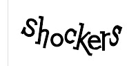
then using the direct select tool and the join points command (ctrl+j) i edited each of the letter forms to be more of the shape that i wanted. at this point i increased the tracking in so as not to lose length.
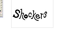
then i made further adjustments to the characters with; the direct select tool, the convert anchor point tool (shift+c) and the join command to add the curves to the letters. it took quite a long time to get the relationship between the characters correct. i used the transform each command (ctrl+shift+alt+d) reducing the scale, to reduce the o's counter.
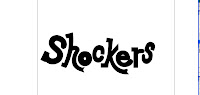
to restore the weight balance between the characters i went through and added a black stroked to each of the characters.
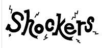
i then increased the tracking again and added little electricity effects around the word.

for the stroke i duplicated the text layer and put it behind the original. then i made all of the characters into one compound path (ctrl+8). i added a very large stroke to the patch giving me the boarder around the letters.

the final changed involved fixing a few places where i had missed joining paths together which where making the stroke look strange and changing the text to white as that is the colour that sweet packaging text appears.
i still think i could add some highlight shapes within the characters but i will wait and see how it looks on the packing first.


