I have had a few long train journeys in this holiday and during those journeys I wrote down a list of starting points, thoughts, aims & possible inspiration for this project. They are currently in my monthly note/sketch book so I am going to write them here; (key ones in bold)

  • Think big
  • Be ambitious
  • Collaborate
  • Try get sponsors/contacts
  • Draw inspiration from culture & artists
  • Keep it simple
  • Great first impression
  • Say no to trends
  • Trust what I'm doing
  • Plan my time
  • Make more lists and cross them off
  • Draw inspiration from classic forms
  • Draw inspiration from what I have read
  • Maybe Make a custom typeface which embodies the creative vision
  • I would like to use 3D models that I have made, it would be something new & fun
  • Draw inspiration from architecture
  • Read more about architecture
  • Take colours & pallets from nature
  • Read some creative manifestos, then write my own.
  • Take key words & concepts from the brief e.g. tone of voice
  • Complexity and detail is cool!
  • Consider stripping back to fundamental design principles
  • Create things with my hands first then digitally later
  • Literature is a good source of inspiration which I don't currently use
  • Work with recycled & found items
  • Don't just think big, work BIG
  • Gas silos are interesting, what mechanisms make them work (it was a looooong journey)
  • Modernism is naff
  • Look at the annual reports of the companies that have given my chosen briefs
  • Subtle detail on off-white works
  • The briefs are about engaging with he target audience therefore market research is key
  • Combine typefaces
  • Use the latest software
  • Find fun interesting & unique ways of working
  • Look up Jasper Morrison
  • Visit these sights:- Harryparr-young.com, anettreiche.com, malinbergstrom.se
I also wrote down this quote from the book which I am currently reading, M Bal (1994), On Meaning-Making: Essays in Semiotics.

the sign is a sign not only because it stands for something, but also because it dose not stand for something else. It is the difference between red and green (traffic lights) that makes each of these two signs function. This difference is the basis of semantics.


I think that I really could make strong use of this within my project & design.

There are 17 different briefs to choose from and I only have to choose two of them to start developing so in order to make this process easier I have decided to make a shortlist of five key projects.

our tutor have already outlined certain brief which she feels are not as related to out digital media degree. we have been advised to only choose the briefs in red and orange if we have a strong reason for wanting to do so.


this leaves me with:

  • BME
  • Fairtrade
  • Green & Blacks
  • Marks & Spencer
  • Sega
  • Thames Clippers
  • The Big Issue
  • The Open Uni
  • Tuborg
  • Warp

This is only 10 projects so I have to cut the projects in half, though I am quite interested in the P&O ferries brief as it is the kind of brand profile raising that I am currently quite interested in.

I am going to be quite decisive with cutting them down, in order to practice the skill.

Immediate removals

Sega
I think that this will be a very competitive brief & that it will be very hard to create something that works. While all the briefs are hard, and I look forward to the challenge, I think the skills needed to make the Sega brief work are not as interesting as some of the other briefs.

Thames Clippers
Though I do think that this brief dose have the scope for some very interesting large scale advertising events I am not very interested in the subject matter and think It would be better to spend my time working on something I'm more passionate about.

The Big Issue
when I read this brief the key points it is asking me the address are the misconceptions and The Big Issue as a whole. while I think this is a good social issue I can not picture ideas of directions in my head for this brief while I can for the others.

Fairtrade
I have made moving image pieces for the past 3 projects I have made and I would rather do some form of print advertising for this project.

Tuborg
I have just finished a assignment which asked me to do a very similar thing to this so I think I would be able to create a good outcome for this project. However I don't want to be working on similar projects, as I feel my time on this course should be spent doing a wide variety of projects.

There where more than I was expecting that I would be willing to just drop. I really like the final 6 however so I am just going to have to drop the one I like the least.

Having re-read the briefs I have chosen to drop
BME. I have chosen this brief because while I do have a strong interest in music I am not very familiar with British artists and the British music industry. I do know a little but I feel like you need to have a vast web of knowledge on it in order to create a truly great response to this brief.

This leaves me with my shortlist of 5 consisting of

  • Green & Blacks
  • Marks & Spencer
  • P&O
  • The Open Uni
  • Warp

I am going to blog about these 5 in more detail looking,
  • picking the briefs apart looking for key words and paraphrasing the briefs into 1 short paragraph
  • thinking of a few responses that I could do for each brief
  • look at a small amount of examples of similar projects & campaigns
once I have done this I should be in a position to choose the final two which I will then develop ready for 'pitch' day.
We have received the brief for our project which will go across the winter holidays and then have one month to finish when we get back. I am really excited about this brief as there is massive potential to do a wide variety of things.

Brief
YCN is a design agency which describes itself as
‘Producing work across all media and representing the finest creative people for
commissions and collaborations’. They say of themselves that ‘YCN today produces
advertising, design and other creative communications in all media; both for its
own projects and ventures, and on behalf its various clients’. They are a ‘group
of designers, art directors, developers, writers, illustrators and project
managers work together at 72 Rivington Street in London’.
(http://agency.ycnonline.com/) They also run an annual competition which offers
students the chance to fulfill creative briefs from a range of high profile
clients and enter that work in a competition. ‘The YCN Student Awards shine a
light on new creative talent, and centre on a collection of live creative
briefs’. (http://awards.ycnonline.com/)
Winning a competition such as this
one often results the work being commissioned commercially is a good career
starter.
For this assignment you will choose from a list of YCN Award briefs

there are 17 diffrent brief for us to choose from the clients are as follows:
  • 20th Century Fox
  • BME
  • Boost
  • Directline
  • Fairtrade
  • Fedrigoni
  • Green&Black's
  • Marks&Spencer
  • P&O Ferries
  • Sega
  • Ted Baker
  • Thames Clippers
  • The Big Issue
  • The Open Uni
  • Tuborg
  • Warp
  • Whyte&Mackay

I am going to approach this by not thinking about who the clients are but instead to look at the briefs and think which ones i would most like to answer.

Key dates

10th jan
we have to present an idea for 2 of the briefs. in this lesson we will give each other feedback on our ideas and choose which one we will create a final piece for. by this point I need to have done lots of research work and figured out the genral style direction which i want to go with the projects.

13th jan
we will visit the YCN office in London to discuss the briefs. the effect of this might mean a rethink on the ideas but by that day I need to be able to talk comftable about my idea and be able to describe it enough so that someone could visualise the end result.

crit is 7th feb
It is good that we have crit befor the deadline as it gives us time to make the little changes that might have been suggested in crit. I would like however for to be at a stage where I could present my work for crit by the 1st of feb. doing this will allow me to really finess my work and make sure thats its the best itteration the of concept it can be.

deadline 10th feb
Damn internet explorer, I just wrote out a long evaluation and it crashed!

I have now finished my project and here is my finished piece.


overall I am happy with how it has turned out. I had to do a load of drawing and I now feel like I have given myself
I have finished drawing the first 10 seconds of my animation so I quickly sequenced it in Quick Time Pro and have posted it on youtube so that you can see how the animation is looking. I am please with how it looks to be turning out. although still not great the animation is smoother than i was expecting from my first atempt.

while I have been drawing the frames out I have come accross a few problems.
they both come from the fact that I have been drawing out a frame on everypage to give me the 720p aspect ratio.

the first is that as I trace the frame though the paper onto the next page I can not do it exactly. this results in the possition of the frame slipping over time. so that after a few seconds the frame is in the wrong place. To stop this I being an issue I have started redrawing the frame after it gets really bad and written FR, for Frame Reset, in the corner. This will allow me to see where I have started again on the computer and only sequence the pictures up to the right point. then on after effects I can animated them to turn over time resulting in the images being the correct orientation when I edit.

another problem I have come accross is that when I started drawing the frames I was doing that at slightly the wrong size. it is too late to do anything about this now. what I can do is once I have scanned all my images and put them into after effects is increase the scale of the images and then position them so that you can't see the edges of the frame. this is not such a bad problem as there is no key detail that happend at the very bottom or top in this animation because of the broadcast safe regions.
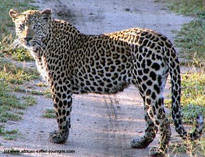
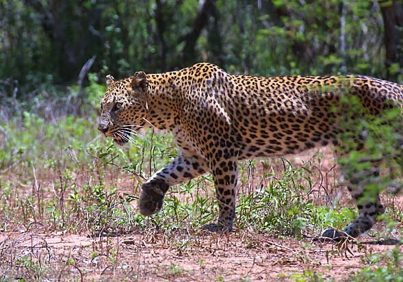
I have realised that I'm not very good at drawing leopards so I have been practicing drawing them in my sketchbook. i have used the following images and videos to help me get the anatomy right.

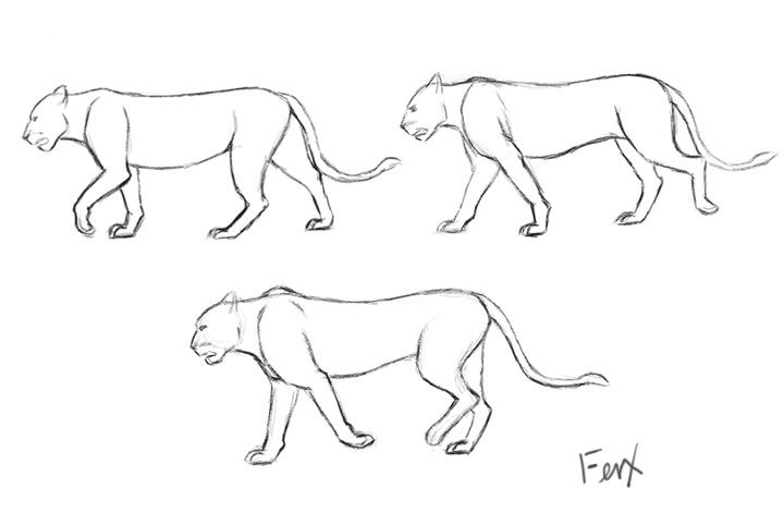
I have also been trying to work out the walk cyle of a leopard and have found a very useful website, found here, which details the basics of the 2 legged walk cycle and how to draw them. Using that and the drawn images of 3 parts of a leopard walk cycle below I have been able to draw out the walk cycle in my sketch book.


note:
these videos are wrong leopards don't walk like that there legs are out of sync e.g when the front left leg go forward the back left leg goes backwards.

I have started practicing drawing the diffrent scenes and trying to think about how the animation will work. in order for it to look as realistic as possiable I have been looking at real video footage and trying to pick out some of the movement which I could esaily replicate in an animation.
while I am trying to make the animation appear handdrawn on flat paper I want the audience to get a sense of depth and an ability to reach inside the frame past the page which the drawing is on.

http://www.backdropsfantastic.com/backdrop_images/300's/OA-008-African-Savannah-7.jpg (this image wont embed)


top