we looked at some websites in lesson the other day for inspiration which I found really useful as i did not realise just how much is possible just using code and images. this means that i can raise my standards on what i will be able to produce.

i have been looking on the unmatchedstyles.com at the feature websites they post.

this website has a very clean look with a striking orange pallet. it contains strong stylised vector based illustrations which tie all the pages together. the buttons have a nice weight to them and the hover bounce makes it satisfying to use them increasing the enjoyment of the website. it has good use of highlighted text which draws your eye to the key points.
this is technically a 1 page website with the navigation buttons at the top scrolling the page down for you, the effect of this is that there is a some interesting movement as the pages scroll between each other. it works because of its minimal style and our understanding of websites making it surprise us when the page scrolls down to reveal the topic we selected instead of a new page being loaded.

this website has a very stylised cut out style and heavily uses images instead of text to creat its look. part of the first page goes below the fold but you are enticed to scroll down by the words "+loads more" at the bottom of the page. while scrolling dose not actually reveal much on the home page it sets a precedence for you to do the same on the other pages. the website keeps uniformity with the repeating navigation header, page logo and background (a very common feature in websites) it also uses a continued pallet and text box layout. it breaks its repeating background on one of the pages(hack day) relating to night time events which is represented in its night themed background. the break is mainly just a colour one as the other elements stay located in the same place.
the home page contains images of speakers which when hovered over rotate slightly. this addition of movement would be very fitting for my animation themed website. another note on the images is that they are all in greyscale, this is so they they all look uniform as it would have been costly to gather all the speakers in the same place with a professional photographer so as just to have colour photos.

this website has a strong colour pallet and interesting use of straight lines to direct your eye to parts of the text. i also fine the light coming from the centre top on the page draws my eye even through this is wasted on there page, i think it could be useful on mine for bring people back to the navigation bar.
i feel like there text dose not work well in this website the colour of the main text feels wrong and the use of lighter italic text for key works/statements in the body text clashes with the strong angular feel that the yellow lines bring.
each of there images of flash elements along with the whole website is surrounded by a thick black boarder the same thickness as the yellow lines. this boarder set on the websites dark background is hard to see but really makes the elements stand out and sit comfortably with each other.

this is an amazing website which is built using css and java script. it show just how amazing i could potentially make my site look if i had the codeing talent.

i really like the navigation and layout of this website. it has a very intuitive left to right navigation. the buttons however when clicked out filter out hits from the category instead of showing result that suit it. i really like the about button which slides the whole website over to the right revealing a hidden about section.
the strong earthy colours seems to be a current tread in web design.

having spoken to one of my piers, Simon, i have found out that the animation involved in getting the sliding effects is doing using java script. i think it would be wise to keep any use of java script to a minimum so as not to overcomplicate things as the nice aesthetic touches it brings can be worked around with good design.
i have been asked to present a pitch in 1 weeks time.
this pitch should contain the proposed content, layout, interface designs and look and feel of the website. this should include
  • Wireframes - sketched layouts without fills (http://totheweb.com/images/sub/wire_frame_example.gif)
  • Flow diagrams - pages and conections (http://ausweb.scu.edu.au/aw04/papers/refereed/kong/WAAF_Fig5_User_interface_flow_diagram.gif)
  • Graphics - style
  • proposed content - topics
  • logo and heading designs
  • interface designs - buttons, tabbs etc
  • page mock-ups

this pitch means that i will have to do a large amount of content research in the next week.
i will use a pdf to present my presentation and will use images instead of pages of text.
so i have a new brief. i am going to try and manage my time for this project as i do not the software we will be using for construction and will not be able to work as fast. its also a good excuse to stop me wasting time on youtube and facebook!

Brief
You will research, design and build a website on an aspect of digital media design theory useful in your degree course. The target audience for this website is other design students, so you should introduce the topics assuming no previous knowledge of the subject but you can take it beyond the basics. this is not a software skills website, it's about design principals. For example, you need to cover how to approach drawing and why it's useful for a designer to draw rather than how to use illustrator to achieve a particular effect.

The making of this website is intended to introduce you to the key concepts and technological restraints that shape good contemporary web design.


i have been assigned the topic of animation for my website.

it will be constructed using text wrangler not dreamweaver which means i have to code everything.

key points
  • layout
  • navigation
  • design principles
  • legibility & usability
  • simplicity (S.H.E from John Meades laws of simplicity)

i will design my website then approach construction and revise as necessary. this way i will not need to limit the creative process.
having written my essay i need to present it as a booklet. I will be using Adobe indesign to do this. having read some books about grids and layouts i know that the optimum number of characters per column is between 7-10 so i will be aiming for this when choose the size of my columns.

i have done some thumbnails of possible layouts.
(click image for larger version)

when brining this file home from uni it corrupted so you can not really see the the 2:3 grid guides which where used to create the shapes.
from these I like the bottom and top aligned images. they appear more interesting to me and they would allow me more space for folio numbers and titles.

i will be putting the English and German side by side for my booklet. so each of the black squares you see will be divided into 20 columns.

for the front cover I will use the blue colour that i have been using as the background for all of my items. it will just have simple text saying Josef Muller-brockmann.
I have finished designing my leaflet. below you can see the sides.
side 1 (note: the grey bar under the 4 squares in the middle is text about
who designed the leaflet. it dose not show in this export due to the quality settings)
side 2
(click images for larger version)

i am quite happy with the finished result as when its folded the elements should line up to create some interesting interactions. I chose to go with having both English and German versions of the text like MB dose in his publications which i think worked well for the larger text but with the small descriptive text it feels like it needs some form of divider. i set up the quotes to act as this divider but as i can not print it to see if it worked i will have to wait and see.

i have decided that the text in my leaflet is going to consists of
a time line
a brief review of Muller-Brockmann
Quote about or by MB

for the time line i have found several websites that have a time line so I will use them changing the words where needed.
there is also an intresting infographic about MB's influence in modern graphic design

for the quote i have several ideas. taken from books i have read and web pages
What you create can be stronger than yourself. - jmb
Quality is largely an attidude. If we insist on it in every small thing, it will permeate everthing we do. - jmb
I still reserve the right, at any time, to doubt the solutions
furnished by the Modular, keeping intact my freedom, which must
depend on my feelings rather than my reason. -jmb

for the brief history i will have to wait and see if my leaflet needs to be from the 50's or can be from after his death in the late 90's to see what it contains. but currently I will count it as the 50's.
i will write this later once i know how large i need it to be, in the mean time I will use lorem ipsum.

I would like to present the leaflet ,and booklet, in German as that is his native language but
if that is not possiable i have noticed from all the publication published by MB is that they all
contain both English and German versions of the text side by side so i will replicate this.
the latter idea is probably a better idea as it is more in keeping with MB's design choices.
having done some sketches on a new graphic for the poster I chose and idea to develop. but this idea did not work as I could not arrange all the elements to sit comfortably with each other, even when completely rearranging the text. below is the graphic which I had difficulty with.
(click image for a large version)

after this failed I took one of my other ideas and developed it. this idea turned out to work alot better. and has a feeling of movement that my design was lacking earlier. i am unsure to go with the black or dark blue background, the black is what the classic posters in the style have but because of using 2 curves for each part to create a sliding motion it is more like the posters a little after (see the first poster in the post below). I will leave the colour decision for a little while and come back to it.
(click images for a large version)
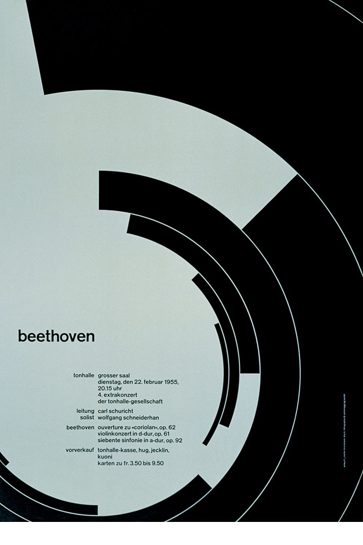
after talking to my tutor about my poster it was pointed out that my poster lacks the sense of movement and music which the simple elements in Muller-Brockmanns work. you can see it in the examples of posters from the mid 50's by him.


to start my poster I wrote out the text I was going to use in Akzidenz Grotesk, the font that Muller-Brockmann used from 1951 onwards. the fact that the font i had picked was on his Tonhalle posters from the mid 50's and the quantities of text which i had was also closer to his mid 50's posters made me change my idea to create a poster from that era.
the graphic on these posters all have something to do with Fibonacci, they often involve a minimal amount (4 to 5) of shapes, some of which go off the sides of the page. the graphics on them are based on underlying grids.
trying to express the feeling of Rachmaninoff, I had from doing the thumbnails, I created a graphic based on the possibilities of a 20-field picture grid. below are some of the drafts along with my final idea.
(click images for a larger version)

the red poster is the final version. but I'm still unsure about how close the bottom of the text is to the graphic so may come back and change it.
the design features Fibonacci in the layout of the graphic which are esaily grouped as a 2 then 3 from which ever way you look at it. they elements are also arranged on a golden spiral.
the colour choice was very easy as Muller-Brockmann only used only a small pallet of natural colours in this series of posters.


For the graphic for my poster I have used a program called Alchemy to generate a large amount of thumbnails, in order to give me something to work with. I set Alchemy to clear my canvas every 30seconds then drew, while listening to Rachmaninoff, the sounds that I heard. I also set it so the line drawn changed with the speed which I drew it and so I could not see what I was drawing until I had finished all of the sketches; this was done to prevent me being influenced by anything other than the music.
I don't know if this is how Muller-Brockmann worked and I doubt it is but I felt it would be a good way to express the musical abstraction, in a 2d form, he talks about. below is the contact sheet of all of the sketches.

(click image for larger version)

from these I really like 2, 5, 16, 21 and 23 these ones stand out because I feel they can be used to go around the text and have several strong shapes in them.
i then used Photoshop to draft more ideas using the sketches as a base.

(click image for larger version)


Muller-Brockmann was a strong believer in the grid system so I will produce my poster based on a grid. In his book Grid systems in graphic design, Muller-Brockmann states:
the problem posed by the job must be studied befor work can begin. Questions regarding the format, the text and illustration, the typeface, the printing method and puality of paper must be cleared up. The designer then begins to approach the solution of the problems by means of small sketches.
I have done some sketches of grids in my sketch book but upon further research of Muller-Brockmann i found that the grids for these posters are based around the graphic with the text falling on very simple 2,3 or 4 column grids. i have done some thumbnails of text layout to try get more of a feel for the poster, I have used black Quadrilaterals to represent the text.
(click image for larger version)

out of those I like the original two as they have a nice clean look to them. looking at Muller-Brockmann's work he went from a style similar to the the bottom middle and left images to one more like the first two as he made more posters.

the grid i am using for the poster was constructed in illustrator. it is based on the verso page of a symmetrical grid and has 3 columns. this kind of grid is not needed for my poster but I will be using a version of it for my booklet.

being from Switzerland Muller-Brockmann's posters are in german so in order to make my poster authentic i have translated what is said on some of his posters.

original
leitung
Eugen Ormandy
solist
Alexander Brailowsky
klavier

Juni-festwochen Zürich 1951
Tonhalle Grosser Saal
Dienstag, den 19. Juni 1951, 20.15 Uhr

C.M.v.Weber Ouvertüre zur Oper Euryanthe
F. Chopin Klavierkonzert Nr1, in e-moll
P. Tschaikowsky Sinfonie Nr.4 in f-moll, op.36

Karten zu Fr. 5.50 bis 16.50 im vorverkauf:
Tonhallekasse, Hug & Co., Jecklin und Kuni

translated

leitung
Eugene Ormandy
solist
Alexander Brailowsky
klavier

June festival Zurich in 1951
Tonhalle Big hall
Tuesday, 19th June, 1951, 20.15 o'clock

C.M.v. Weaver Ouvertüre to the opera Euryanthe
F. Chopin piano concert Nr1, in e minor
P. Tschaikowsky symphony Nr.4 in f minor, op.36

cards to 5.50 Frs to 16.50 in advanced booking:
Tohnallekasse, Hug & Co., Jecklin and Kuni
there are a few words it did not translate which i dont know
the translations are
leitung: conductor
Klavier: pianist

for my poster i will use very similar text to this. i think that having the text pre determined will help my design appear real as it will simulate working practices.
my text, i got the names by looking at swiss first names and common surnames.

Leitung
Adrian Baertschi

Solist
Georgette Fah

Klavier
Lukas Lautens

monday 11th januar 2010
20:15pm
Tonhalle Grosser Saal

S. Rachmaninoff Étude-Tableau in E-flat minor
Y. Tiersen Tout est Calme in f-minor
L.v.Beethoven String Quartet, Diabelli Variations

Vorverkauf: Tonhallekasse hug & co. Jecklin Kuoni


translation
Leitung
Adrian Baertschi

Solist
Georgette Fah

Klavier
Lukas Lautens

Montag 11. januar 2010
20:15 Uhr
Tonhalle Grosser Saal

S. Rachmaninoff Étude-Gemälde in E-moll sharp
Y. Tiersen Tout est Calme in F-moll
L.v. Beethoven Diabelli Schwankungen

Vorverkauf: Tonhallekasse hug & Co. Jecklin Kuoni

i have chosen to do my project on Swiss Graphic designer Josef Muller-Brockmann.
in particular this series on concert poster from the 50s for the Zurich Tonhalle.

these posters use "geometrical and abstract elements arranged in free, non-constructive two dimensional compositions."
(click image for larger version)
top