In my lesson we have spoken through methods for planning the website we will be producing for phones. we can up with ideas for the structure and then I used mindnode to draw a rough plan of my website.


currently I'm thinking that I should hide lots of these elements within each other or a large display of the sight map.
During the first day we got set our brief I had several ideas on what direction I could take this. These ideas are;

Rotoscoped Style animations of the bands playing pencil drawing style
this would be presented as short fast paced animations that can be shared and linked to friends because of the interesting style in which they are animated.

traditional view of Art based
I was thinking that what ever I produce should be inspired by art. When i say a traditional view of art which has on overt meaning such as a basic oil of a landscape. that is what I can see appealing to the target audience the most.

Portraits of artists cut into the grass
I came up with this idea when trying to think of possible ambient media techniques. I could also produce large portraits of artists on brighton beach and in other places in east sussex. these could take the form of large pieces which are hard to figure out what they are unless viewed from a distance like the white horse (though that would be a little out of my depth) of they could be done small scale like graffiti stencils but instead of spraying paint onto the stencil I can cut the grass which pokes through it.

Create a poster to appear in Don't Panic
I knew of dont panic as a free envelope which contains posters adverts and information about whats going on. looking at the website however it is much bigger than just that and also produced a magazine as well as web TV content. I could produce content for this as it would be seen by a large amount of young people.

Juxtaposing the quite town with the party spirit of a festival
Though I think this is quite an overused ideas I think It could work with the sight.

Lyrics
fans of bands will know the lyrics so I think doing something based on the lyrics of the bands that are performing. For this I need to listen to the music form some of the people playing.

I also wrote down a method to approche coming up with a good idea. It's a method that lots of people use but I felt like writing it down would help me stick to it.

Look at media forms
Look at communication forms
Look at no comercial media practice

try to highlight areas that can be combined to create something "new"

package it for meadowlands

try to find an emerging trend to add excitement to the idea
I have been looking at the current web presence that meadowlands to see where I can improve it and what I think they are doing well. I've left the links in full so you can see how easy they are to write out on your own.

Website
http://meadowlandsfestival.com/
Their website has a strong colour pallet and illustration style. The content is not very inviting to read and there are interesting pages which you may not fine if having a quick look. such as clicking on the line up tab gives a page which shows you the basic line up and prompts you with text to look at the other options in the drop down, but having quickly see who's playing I feel people will not necessarily look further into the website where better information is found.

The information about the bands performing on each day is presented in the form of a blog but there is no incentive for users to click the read more. It would be good to have embedded media with samples of the bands music.

Twitter
they use there twitter to link back to the facebook page and link to other places where they have an online presence. they tweet semi regularly keeping a steady steam of information to those who follow but they currently only have 85 followers.

it need some incentive for people to want to follow the twitter.

Facebook
They make good use of posting regular information on there facebook page. the information comes in an informal way and has embedded video clips of the bands or there posters. but again there is no good incentive for people to contribute there own things here.

there is a disappointed review on their review page which starts out saying

Actually it was a real let down, 2 stages with good music, but absolutly nothing in between, empty space, few food stalls. Was bored for much of it. nothing for kids to do apart from bouncy castle that was deflated for the most of first day, and tiny tent for making stuff for younger kids for 2 hrs each day. apart from that nothing.

this made me think that as well as just advertising bands I should aim to advertise the festival vibe and try inspire people to have fun by themselves within the grounds.

other places where I have found Meadowlands linked are below.


only one of the links has links to the festivals facebook page.
one of them has a forum which would be good to get involved in so that people get that feeling of community and a approachable festival.

old

We have now started our 2nd to last project although we will now have 3 running simultaneously until the end of the course. The project is a live brief and after a representative, Mark Ede, came in on Thursday to talk to us I now know what we are doing.

Our client is Medowlands Festival in Glynde. It is still quite a small festival in its second year that is expecting to attract 2-4 thousand people. At the beginning of the meeting Mark said this key sentence which sum of exactly what we have to do,
"How can we make people aware of Meadowland? how can we make them excited about it."
The cool thing about this is that we will be able to attend the event! though we will be working.


For this project we will have to produce several different elements. We will pitch these elements in just under two weeks time and get them approved by the client as well as enhanced by the group so that we can begin producing them ready for them to be used. The elements of this project are;
  • Pitch way that Medowlands can use social media more effectively
  • Implementing those more effective ways
  • Pitch innovative ways which the festival can promote itself
  • If approved create these promotional elements
  • Pitch a pre-festival moving image piece/s which will be used to create interest & excitement
  • Pitch a post-festival moving image piece/s which will be used to show the success of the festival
  • Create the moving images Piece/s
  • Pitch ways which we can effectively use out time at the festival
  • Pitch a design for a mobile optimised website which festival goers can access before, during and after the festival to engaging in the social media channels and contribute to it.
  • Create the mobile optimised website (this will be done as a group effort though I imagine it will be done by each of us having to produce 1 page or feature of the website)

As you can see there are quite alot which we have to do for this project. While this project will last for several months the pitch which will determine how the rest of the project goes in very soon. This pitch will have to contain proof of concept pieces & good mock ups.

As a group we did a quick brainstorm to think of ideas on how to promote the festival. Here is what we came up with;
  • Flyering
  • Social networks
  • Posters
  • Sticker campaigns
  • Badges
  • Beer Bottle Jackets
  • Use local media
  • T-shirts
  • Virals
  • Mapping
  • Blogs
  • Competitions
  • Game both physical and digital
  • Promotional films
  • Documentary films

It was made clear the several of these are already being used but some of the ideas could be developed. Currently I'm very interested in producing some form of Viral content as it is something that is new to me and that I imagine would be a load of fun!

Here are several thoughts which I had and a quote from mark during the meeting. I think that these really should form the foundations of my idea development.
  • Our involvement should add value be decisive and take initiative
  • Easy of use will be key
  • Interested in getting youth involved
  • What we produce has to be interactive
  • How do you generate inpresions
  • Digital distribution is key
  • "Official & unofficial festival involvement is fine"
  • Key word Strategy (meaning that I should pitch a strategy not just several separate parts)

I have done loads of bullet points so far there's just one more set coming for this post. We Talked about areas which we will have to research in order to get a idea on what we can produce. Two of these research areas are compulsory and I will have to talk about in my pitch so I will put these in bold.
  • Music promotion
  • Band promotion
  • Mobile & 3G coverage
  • optimizing web content for mobile
  • what current festivals are doing
  • Festival imagery
  • Festival culture
  • Copy write and public filming laws

So that's a brief summary of what my new project is all about. There will be a large amount of posts in the next few weeks as that is when all of my preparatory work has to be done, and so far I've stretch it out for the whole project.
I have now submitted the pieces I have created for this project below you can fine the final outcomes.


Here is an interactive PDF viewer which surprise surprise you can view my pdf on!
As part of the project we have been asked to submit a pdf document explaining our thought process and creative decisions. My project already has a strong styling so I am going to the same to present my pdf document.
On the D&AD website you can view past submissions. These submissions have pages submitted with them which are in a similar style to what I'm required to submit. below are some examples of pages which i really like.

turns out you have to be logged in to view them, but if you are a member and care to log in below are the links to the images which I found useful.

http://www.dandad.org/awards/student/2010/download/00299/578581/charlie-hocking-3.jpg
http://www.dandad.org/awards/student/2010/download/01307/578470/sadhbh-o-beirne-2.jpg
http://www.dandad.org/awards/student/2010/download/00644/578636/olga-bukhalova-1.jpg
http://www.dandad.org/awards/student/2010/download/00644/578634/olga-bukhalova-3.jpg
Colour

My tutors thought that the colour palette I had chosen contained several colours which where too similar and could potentially cause confusion. This is a good thing really because I had noticed that I had stupidly picked several colours in the original palette which where out of gamut and was going to have to change them anyway. I have edited the colour palette and come up with a new one.


Due to the colours on my monitor being messed up I had to log on to my housemates computer to see what they actually look like. When I looked I noticed that again the new blue colour I had picked is very similar to the green. My housemate also mentioned that he felt like the browns where still quite similar colours and that I should adjust them as well.
Here is the revised version,


In this palette I have kept the faded pastel tones which I had in previous versions but I have strayed away from having the theme based around copper. I feel this is a good decision because It allows me to have 5 distinct colours to represent each pillar of Plan A. As part of an identity this distinction is really important as it allows the audience to instantly recognise the relevant parts of the campaign.

So the colour thing happened again when I went to check the colours and what I thought was burgundy on my monitor is in fact deep purple. The lilac is a little pale compared to the blue so I'm going to make it slightly richer.
quick test,


that better but the burgundy looks a little out of place so I'm going to lighten it.
here is the final revised version.


What I showed


Below are several links, thanks to simon for the website, which I have been looking at to see what I need to provide when creating an identity.
They are also really useful for planning what content and layout style my pdf should contain.

http://www.behance.net/gallery/Maritime-Campus/343149


more commentary later I'm just posting quickly to check the colours.
Here are some Images which I found when looking for inspiration on Hand drawn type before I drew my logo.


I have tried out a quick idea in after effects and you can see the result below.


this is a very flat way of using the logo and I can do alot more with it. but this dose show that the logo has potential to be animated well. ignore the text I just put that in there to help my visualise how it could work. the music I think is better suited than Joanna Newsom as it is more upbeat and inkeeping with M&S method of targeting there TA. the track is Girl Talk - Let it out.

I also want to post a shot animation I saw a week or two ago which has an incredible style. it would be cool to draw on this for the animating. as it would solve the issue of how I would have moving textures looking really good on such simple elements.

I recommend you watch this as its fantastic!
.
Wordmark
I mentioned before that the idea I was going to switch to was a Quentin Blake inspired illustration style. When I considered how I could apply the style to the logo I was encouraged by my tutor to have the larger blocks on colour in my logo maybe drawn in pencil with the line quality of a pencil clearly viable. I then remembered our recent visit to YCN(link to their blog post about the visit, which was great). Before we went to their studio we went to Tate Britain to see the Muybridge & Rachel Whiteread exhibitions.
The Whiteread exhibition was focused on her drawing offering an incite to the creative process behind her pieces. What interests me though is the pen and ink graphical style which she dose her drawing in. I am keen to use this style of drawing for the Wordmark.

Font style

I spoke to my tutor about going back to a handwritten style font like I was playing with right at the start of the project and he really like the idea and pointed me toward Bentley Continental a project which he work on. They have a handwritten font which is used in there promotional materiel. you can see it on this screen grab from there website.


The letter forms are very round and clearly handwritten. they have also kept the grain which the pen used to write it has left. I am going to use a Similar style for my font though the style of handwriting will be different its the grain and clear handwritten style which I want to use.

Music Style

when I started writing this post I was thinking of going along with Joanna Newsom for the music for the moving image pieces, inspired by the trend of emotional melodic songs used in commercials such as the one in loyds adverts a few years ago.


Now however I have realised that that will be not in keeping with the brief and I want Plan A to be a fun engaging part of M&S it is not a charity it is something to celebrate and join in with. Like the music which was in the 2010 christmas campaign. So I think I need to do a little more research before choosing the music

I have drawn up a few of my ideas quickly, though it did take me way too long to find the centre of a pentagon because I was using Illustrators align tools but I've learnt my lesson. from doing this I'm not sure how well the logo will work with each triangle made up of smaller triangles.
I can still keep this idea for when you get in close to each triangle in adverts. I think it is a strong idea that show how Plan A works well. I will have to do some more experimentation.
here is the contact of my work in illustrator;


1 is where I went wrong the first time! 2 is a little bit showing the process. I used the blend tool on scaled down versions of the larger triangle to make up the smaller triangles.
They are currently just solid blocks of colour but I intent to change that and have them have texture as I really feel that adds to the eco feel of the logo.
I'm going to play around with 8 in will AE and see what I can make it do because as I said before this is all about the logo motion.
quite early on when thinking about colour I thought of using copper as a potential theme for the colour. I like this idea because of the natural associations it has while not being the obvious colours. I also think it fits well with the colours which M&S already use.

I went on kuler and had a search for colour themes around the key word copper. below are some of the nice ones I found. I'm wary about using the brown colours as I'm not sure if they will have negative connotations of dirt and waste (though the waste Plan A category dose not have to be the brown).


5 really has the copper colours that I imagined, especially the first teal. It dose seam a little heavy on the green. I would replace the darker green with a gold colour like from 7 and more the final orange colour in 5 more like the orange from 8 and 9.

I quickly put those suggestions together in photoshop and made myself pallet for the 5 colours I will use. I may still come back and tweek this slightly at a later date if needed however.


After putting my ideas on the computer I was really put of by the corporate feeling that they had and was going to scrape the idea in place of a new one. After talking to my tutors they have advised that instead of scrapping the idea I should take the concept of the my new idea, Quentin Blake inspired illustrated logo, and apply it to the old idea. In doing this I have finally been able to nail down my identity and can visualise how it will work in my mind.

The idea is to reverse the star in on its self to make a Pentagon made from a mosaic of round edged triangles. these small triangles will be arranged into 5 larger triangles which will make up the pentagon. the styling on the drawing will be hand drawn and natural which will pull it away from the corporate look.
The 5 larger triangles will each be in there own colour to represent a category.
The smallers triangles which make up each larger triangle represent each of the goals which Plan A is made up of.

The identity will then make use of these smaller triangles arranging them into the shapes needed for each separate element.

I'm going to produce some short animated pieces to show off the logo as it is designed to work really well in motion.

I have messed around in photoshop with a scan of the rough idea.

one problem I can forse is that it will not function as well in black and white.

some inspiration for moving images work that will accompany this


I want my logo to work well in 3D as well as 2d so I did some experimenting with an idea I'm working on in Google Sketchup. this simple 3D modeling program allowed me to quickly play around the the viability of my idea. I then mess around with them a little in photoshop to see what they where like with font. the colours are not final I was just playing around with similar colours to what I have used in my sketchbook.
The idea is to have a 5 sided pyramid which can open out to make a star. sides can remain in or out to show different areas of plan A. I feel like this looks very corporate and that is not what M&S want. I do like the idea of having a logo which can change slightly to show different categories.
From doing this I have noticed that the final logo really has to have some great detail or subtleties to stop it looking bland and flat!

here is a collection of some of the things which have been inspiring my development work so far. at the moment its just a series of images but you should be able to see where they have affected my work when I have finished the brief.

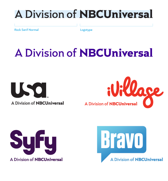
NBCUniversal branding more information found here


top