I have had a few long train journeys in this holiday and during those journeys I wrote down a list of starting points, thoughts, aims & possible inspiration for this project. They are currently in my monthly note/sketch book so I am going to write them here; (key ones in bold)

  • Think big
  • Be ambitious
  • Collaborate
  • Try get sponsors/contacts
  • Draw inspiration from culture & artists
  • Keep it simple
  • Great first impression
  • Say no to trends
  • Trust what I'm doing
  • Plan my time
  • Make more lists and cross them off
  • Draw inspiration from classic forms
  • Draw inspiration from what I have read
  • Maybe Make a custom typeface which embodies the creative vision
  • I would like to use 3D models that I have made, it would be something new & fun
  • Draw inspiration from architecture
  • Read more about architecture
  • Take colours & pallets from nature
  • Read some creative manifestos, then write my own.
  • Take key words & concepts from the brief e.g. tone of voice
  • Complexity and detail is cool!
  • Consider stripping back to fundamental design principles
  • Create things with my hands first then digitally later
  • Literature is a good source of inspiration which I don't currently use
  • Work with recycled & found items
  • Don't just think big, work BIG
  • Gas silos are interesting, what mechanisms make them work (it was a looooong journey)
  • Modernism is naff
  • Look at the annual reports of the companies that have given my chosen briefs
  • Subtle detail on off-white works
  • The briefs are about engaging with he target audience therefore market research is key
  • Combine typefaces
  • Use the latest software
  • Find fun interesting & unique ways of working
  • Look up Jasper Morrison
  • Visit these sights:- Harryparr-young.com, anettreiche.com, malinbergstrom.se
I also wrote down this quote from the book which I am currently reading, M Bal (1994), On Meaning-Making: Essays in Semiotics.

the sign is a sign not only because it stands for something, but also because it dose not stand for something else. It is the difference between red and green (traffic lights) that makes each of these two signs function. This difference is the basis of semantics.


I think that I really could make strong use of this within my project & design.

There are 17 different briefs to choose from and I only have to choose two of them to start developing so in order to make this process easier I have decided to make a shortlist of five key projects.

our tutor have already outlined certain brief which she feels are not as related to out digital media degree. we have been advised to only choose the briefs in red and orange if we have a strong reason for wanting to do so.


this leaves me with:

  • BME
  • Fairtrade
  • Green & Blacks
  • Marks & Spencer
  • Sega
  • Thames Clippers
  • The Big Issue
  • The Open Uni
  • Tuborg
  • Warp

This is only 10 projects so I have to cut the projects in half, though I am quite interested in the P&O ferries brief as it is the kind of brand profile raising that I am currently quite interested in.

I am going to be quite decisive with cutting them down, in order to practice the skill.

Immediate removals

Sega
I think that this will be a very competitive brief & that it will be very hard to create something that works. While all the briefs are hard, and I look forward to the challenge, I think the skills needed to make the Sega brief work are not as interesting as some of the other briefs.

Thames Clippers
Though I do think that this brief dose have the scope for some very interesting large scale advertising events I am not very interested in the subject matter and think It would be better to spend my time working on something I'm more passionate about.

The Big Issue
when I read this brief the key points it is asking me the address are the misconceptions and The Big Issue as a whole. while I think this is a good social issue I can not picture ideas of directions in my head for this brief while I can for the others.

Fairtrade
I have made moving image pieces for the past 3 projects I have made and I would rather do some form of print advertising for this project.

Tuborg
I have just finished a assignment which asked me to do a very similar thing to this so I think I would be able to create a good outcome for this project. However I don't want to be working on similar projects, as I feel my time on this course should be spent doing a wide variety of projects.

There where more than I was expecting that I would be willing to just drop. I really like the final 6 however so I am just going to have to drop the one I like the least.

Having re-read the briefs I have chosen to drop
BME. I have chosen this brief because while I do have a strong interest in music I am not very familiar with British artists and the British music industry. I do know a little but I feel like you need to have a vast web of knowledge on it in order to create a truly great response to this brief.

This leaves me with my shortlist of 5 consisting of

  • Green & Blacks
  • Marks & Spencer
  • P&O
  • The Open Uni
  • Warp

I am going to blog about these 5 in more detail looking,
  • picking the briefs apart looking for key words and paraphrasing the briefs into 1 short paragraph
  • thinking of a few responses that I could do for each brief
  • look at a small amount of examples of similar projects & campaigns
once I have done this I should be in a position to choose the final two which I will then develop ready for 'pitch' day.
We have received the brief for our project which will go across the winter holidays and then have one month to finish when we get back. I am really excited about this brief as there is massive potential to do a wide variety of things.

Brief
YCN is a design agency which describes itself as
‘Producing work across all media and representing the finest creative people for
commissions and collaborations’. They say of themselves that ‘YCN today produces
advertising, design and other creative communications in all media; both for its
own projects and ventures, and on behalf its various clients’. They are a ‘group
of designers, art directors, developers, writers, illustrators and project
managers work together at 72 Rivington Street in London’.
(http://agency.ycnonline.com/) They also run an annual competition which offers
students the chance to fulfill creative briefs from a range of high profile
clients and enter that work in a competition. ‘The YCN Student Awards shine a
light on new creative talent, and centre on a collection of live creative
briefs’. (http://awards.ycnonline.com/)
Winning a competition such as this
one often results the work being commissioned commercially is a good career
starter.
For this assignment you will choose from a list of YCN Award briefs

there are 17 diffrent brief for us to choose from the clients are as follows:
  • 20th Century Fox
  • BME
  • Boost
  • Directline
  • Fairtrade
  • Fedrigoni
  • Green&Black's
  • Marks&Spencer
  • P&O Ferries
  • Sega
  • Ted Baker
  • Thames Clippers
  • The Big Issue
  • The Open Uni
  • Tuborg
  • Warp
  • Whyte&Mackay

I am going to approach this by not thinking about who the clients are but instead to look at the briefs and think which ones i would most like to answer.

Key dates

10th jan
we have to present an idea for 2 of the briefs. in this lesson we will give each other feedback on our ideas and choose which one we will create a final piece for. by this point I need to have done lots of research work and figured out the genral style direction which i want to go with the projects.

13th jan
we will visit the YCN office in London to discuss the briefs. the effect of this might mean a rethink on the ideas but by that day I need to be able to talk comftable about my idea and be able to describe it enough so that someone could visualise the end result.

crit is 7th feb
It is good that we have crit befor the deadline as it gives us time to make the little changes that might have been suggested in crit. I would like however for to be at a stage where I could present my work for crit by the 1st of feb. doing this will allow me to really finess my work and make sure thats its the best itteration the of concept it can be.

deadline 10th feb
Damn internet explorer, I just wrote out a long evaluation and it crashed!

I have now finished my project and here is my finished piece.


overall I am happy with how it has turned out. I had to do a load of drawing and I now feel like I have given myself
I have finished drawing the first 10 seconds of my animation so I quickly sequenced it in Quick Time Pro and have posted it on youtube so that you can see how the animation is looking. I am please with how it looks to be turning out. although still not great the animation is smoother than i was expecting from my first atempt.

while I have been drawing the frames out I have come accross a few problems.
they both come from the fact that I have been drawing out a frame on everypage to give me the 720p aspect ratio.

the first is that as I trace the frame though the paper onto the next page I can not do it exactly. this results in the possition of the frame slipping over time. so that after a few seconds the frame is in the wrong place. To stop this I being an issue I have started redrawing the frame after it gets really bad and written FR, for Frame Reset, in the corner. This will allow me to see where I have started again on the computer and only sequence the pictures up to the right point. then on after effects I can animated them to turn over time resulting in the images being the correct orientation when I edit.

another problem I have come accross is that when I started drawing the frames I was doing that at slightly the wrong size. it is too late to do anything about this now. what I can do is once I have scanned all my images and put them into after effects is increase the scale of the images and then position them so that you can't see the edges of the frame. this is not such a bad problem as there is no key detail that happend at the very bottom or top in this animation because of the broadcast safe regions.
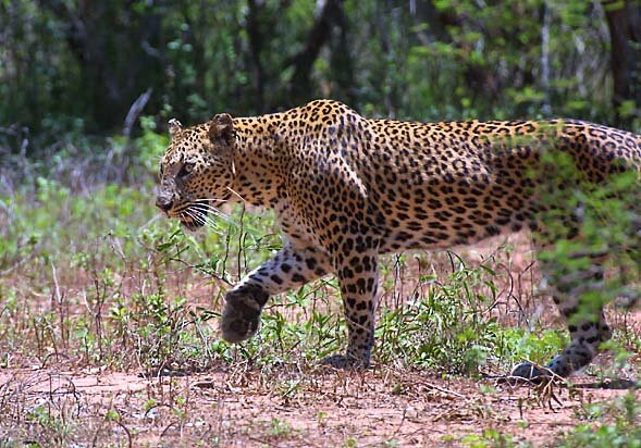
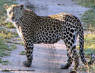
I have realised that I'm not very good at drawing leopards so I have been practicing drawing them in my sketchbook. i have used the following images and videos to help me get the anatomy right.

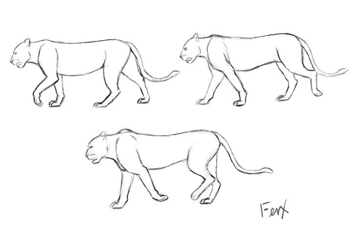
I have also been trying to work out the walk cyle of a leopard and have found a very useful website, found here, which details the basics of the 2 legged walk cycle and how to draw them. Using that and the drawn images of 3 parts of a leopard walk cycle below I have been able to draw out the walk cycle in my sketch book.


note:
these videos are wrong leopards don't walk like that there legs are out of sync e.g when the front left leg go forward the back left leg goes backwards.

I have started practicing drawing the diffrent scenes and trying to think about how the animation will work. in order for it to look as realistic as possiable I have been looking at real video footage and trying to pick out some of the movement which I could esaily replicate in an animation.
while I am trying to make the animation appear handdrawn on flat paper I want the audience to get a sense of depth and an ability to reach inside the frame past the page which the drawing is on.

http://www.backdropsfantastic.com/backdrop_images/300's/OA-008-African-Savannah-7.jpg (this image wont embed)


I have looked into what working at 8fps will look like and here are some videos which I found that use a frame rate of 8fps. I have decided that I will produce my animation at this frame rate.


four the pitch we had to produce an animatic for the project so that the final project would be visualised. my animation is quite complicated so instead of making the animatic out of the full colour storyboard I made it from the rought thumbnails I'd drawn out. the result of this was that you get to see the camera movement clearer. below is the animatic which I pitched to the class,

the feadback I got from the pitch was that the soundtrack was not working as the begining of it sounds slightly as if it is irish and you dont get the african connection until 1/2 way though the music. they did like the song however so I should just choose a diffrent section of the piece.

they also thought that I should have the tree on the savanah in just one the scenes so as to aviode confusion that the scenes where the same location and so that the tree its self is more intresting.

I was advised that this is going to take a lot of work to finish & that I should be working at a frame rate of about 8fps as that would give me a nice balance between smooth motion and less drawing to do.

I did receve some negative critisium for not creating full quality mockups for the animation. however I think that my final art style is going to be very similar to my story boards which I produced so hopefully this should not matter when its finished. though if I were to be giving a pitch to a real client I need to make sure that I do everything possiable to help them visualise the final outcome.
I am currently thinking up idea for my advert and thinking how the whole piece will fit together. in looking for more inspiration I just goggled South African textiles. thought I have to be careful because South Africa is a vast country and some of these textiles may not relate to the Limpopo region (just like Scottish tartans) and its just a Google search so there is no guarantee these are infact all South African. I think the colour and rough styling elements are good inspiration.


I have been to the Advertising Standards Agency website and found the rules for Alcoholic adverts. It is important that I comply to these codes as other wise my advert would be un-broadcastable in the real world.

  • Principle
  • Marketing communications for alcoholic drinks should not be targeted at people under 18 and should not imply, condone or encourage immoderate, irresponsible or anti-social drinking.

    The spirit as well as the letter of the rules applies.


  • Definition
  • The rules in this section apply to marketing communications for alcoholic drinks and marketing communications that feature or refer to alcoholic drinks. Alcoholic drinks are defined as drinks containing at least 0.5% alcohol; for the purposes of this Code low-alcohol drinks are defined as
    drinks containing between 0.5% and 1.2% alcohol.

    Where stated, exceptions are made for low-alcohol drinks. But, if a marketing communication for a low-alcohol drink could be considered to promote a stronger alcoholic drink or if the drink’s low-alcohol content is not stated clearly in the marketing communications, all the rules in this section apply.

    If a soft drink is promoted as a mixer, the rules in this section apply in full.
    These rules are not intended to inhibit responsible marketing communications that are intended to counter problem drinking or tell consumers about alcohol-related health or safety themes. Those marketing communications should not be likely to promote an alcohol product or brand.

    Rules

    Marketing communications must be socially responsible and must contain nothing that is likely to lead people to adopt styles of drinking that are unwise. For example, they should not encourage excessive drinking. Care should be taken not to exploit the young, the immature or those who are mentally or socially vulnerable.

    18.2
    Marketing communications must not claim or imply that alcohol can enhance confidence or popularity.
    18.3
    Marketing communications must not imply that drinking alcohol is a key component of the success of a personal relationship or social event. The consumption of alcohol may be portrayed as sociable or thirst-quenching.
    18.4
    Drinking alcohol must not be portrayed as a challenge. Marketing communications must neither show, imply, encourage or refer to aggression or unruly, irresponsible or anti-social behaviour nor link alcohol with brave, tough or daring people or behaviour.
    18.5
    Marketing communications must neither link alcohol with seduction, sexual activity or sexual success nor imply that alcohol can enhance attractiveness.
    18.6
    Marketing communications must not imply that alcohol might be indispensable or take priority in life or that drinking alcohol can overcome boredom, loneliness or other problems.
    18.7
    Marketing communications must not imply that alcohol has therapeutic qualities. Alcohol must not be portrayed as capable of changing mood, physical condition or behaviour or as a source of nourishment. Marketing communications must not imply that alcohol can enhance mental or physical capabilities; for example, by contributing to professional or sporting achievements.
    18.8
    Marketing communications must not link alcohol to illicit drugs.
    18.9
    Marketing communications may give factual information about the alcoholic strength of a drink. They may also make a factual alcohol strength comparison with another product, but only when the comparison is with a higher strength product of a similar beverage.
    Marketing communications must not imply that a drink may be preferred because of its alcohol content or intoxicating effect. There is an exception for low-alcohol drinks, which may be presented as preferable because of their low alcoholic strength.

    In the case of a drink with relatively high alcoholic strength in relation to its category, the factual information should not be given undue emphasis.
    18.10
    Marketing communications that include a sales promotion must not imply, condone or encourage excessive consumption of alcohol.
    18.11
    Marketing communications must not feature alcohol being handled or served irresponsibly.
    18.12
    Marketing communications must not link alcohol with activities or locations in which drinking would be unsafe or unwise.

    Marketing communications must not link alcohol with the use of potentially dangerous machinery or driving. Marketing communications may feature sporting and other physical activities (subject to other rules in this section; for example, appeal to under-18s or link with daring or aggression) but must not imply that those activities have been undertaken after the consumption of alcohol.
    18.13
    Only in exceptional circumstances may marketing communications feature alcohol being drunk by anyone in their working environment.
    18.14
    Marketing communications must not be likely to appeal particularly to people under 18, especially by reflecting or being associated with youth culture. They should not feature or portray real or fictitious characters who are likely to appeal particularly to people under 18 in a way that might encourage the young to drink. People shown drinking or playing a significant role (see rule 18.16) should not be shown behaving in an adolescent or juvenile manner.
    18.15
    Marketing communications must not be directed at people under 18 through the selection of media or the context in which they appear. No medium should be used to advertise alcoholic drinks if more than 25% of its audience is under 18 years of age.
    18.16
    People shown drinking or playing a significant role must neither be nor seem to be under 25. People under 25 may be shown in marketing communications, for example, in the context of family celebrations, but must be obviously not drinking.
    18.17
    Marketing communications may give factual information about product contents, including comparisons, but must not make any health, fitness or weight-control claims.

    The only permitted nutrition claims are “low-alcohol”, “reduced alcohol” and “reduced energy” and any claim likely to have the same meaning for the consumer.

  • another think which I have noticed on British Alcohol adverts are the worlds please drink/enjoy responsible and a link to drinkaware.co.uk. I can not find any the place where it advises that you place the information on your adverts so i will email the company to find out exactly what they suggest.
I have chosen the section of the song which I want to use so now I can go through it and find the key parts in the music which I can animate things around. I have chosen to take it from 14seconds through to 44 seconds, This section has a nice variation of sounds and a good constant sound.


the song starts 5 seconds in so if you want to find the following times in the video you need to add 5seconds to the stated time.

Key Sounds
I'm going to pull out the key sounds and beats to animate to:

0-2s four drum beats as the song builds up. 1s accordion? (not sure what instrument it is) starts
2s the beat starts
2-15s beat continues with 4 beats taking just under 2seconds. 12s faint bongo (again not sure on the instrument) start.
15s vocals start
17.5s backing vocals start. then from 21seconds and every 4 seconds after they repeat.
22.5s second line of vocals start.
29.5s backing vocals seam to reduce in volume good time for me to fade out.

this gives me 2 main parts of music which suggests to me that I should have two events styles or view points throughout the animation.

I have been trying to think about where I need a voice over as the end of this song has vocals in it. The vocals are sung in the Xhosa and Shona languages so I think its fine if I have speaking over them as my advert is for a western audience who will not understand the vocal in the background.
This advert by Jack Daniel's makes good use of text to not affect the association you get of the bull riding mentality.


I said a couple of posts ago that I needed to look into the brand in more detail, this video is produced by Amarula and is there brand video showcasing what they want to be represented as. I think it provides a good basis for me to understand the exact message which they are trying to get across.


Kwaito is a music genre where was formed in the late 90's in Johannesburg. It is a combination of house music and traditional african sounds with a slow tempo (source). though Johannesburg is in the Gauteng province I think it is a style which is alright to use as it will be popular throughout South Africa.

I think that this genere is just the style which I was looking for. Thandiswa is a female artist who's records are in this style and currently I think that her song Lahlumlenze would be great for my advert, it reminds me a lot of Paul Simon Graceland. I think the Lyrics are really great as well, they are translated as (according to a youtube comment by the uploader),
Whose business is it if I dance, I am proud, take such pride in you Africa, we live through music, yes we live through song, wherever, however, Africans live through song, so whose business is it, whose business is it if I dance.
here is the song,


currently I'm not sure what section to use. I like the beginning section and how it builds up, I think that would allow me to do some nice things with m animation. When the singing kicks in though i think it sounds great and that happens at 30seconds so I want to start a few seconds in. My choice at the moment is between starting at 10 or 15 seconds.

I have been looking into South African poets to try find a verse which I could use as the soundtrack for the advert. So far I have only been able to find two, the first Emmanuel Sairosi's poems are full of anger and negative messages about Limpopo and and there for really not suitable for an uplifting campaign about a product produced in the province. here is a sample of his work

soon the truth becomes apparent
turning back would be out of question
behold ahead lies the battle point
Limpopo
To tell you is to taint you
with all due respects to the parents
those who have lost their children
to lands beyond and afar
Only when you visit the Limpopo
only then can you understand
why your sons and daughters chose that path
Only then can you clearly decipher
the world in the manner
your children rightfully interpreted
It is indeed not just a conventional frequently told myth
The Limpopo has robbed the world
of the thousands of the future leaders
sons and daughters have perished
lured by the treacherous symphonic waters
of this barbaric river
Limpopo smells blood
Limpopo smells victory
Limpopo a two faced conniving brute
Were you not supposed to be the epitome
of that life that we so deeply yearned for?
Limpopo you have ruptured the veins
of hope entrenched in my utopian world
Undeterred exhibiting fearful braggadocio
Limpopo glides like a serpent
squaring up and ready to devour
an unsuspecting karoo lamb.

The seconds poet that i found is Ntshima Ramokone although she dose have some nice works i can not find a piece which fits the brand. here is a sample of her work,

I thought it will not come
As all the hope was gone
But God proofed me wrong
A place with great light of Life
A place of joy and Glory
Which rubs the word love inside me more than sorry
As is the one being chased by it, no attention to him
No, more crying of tears from the eyes of the afflicted me
As it just came with the miraculous surprise
With the joy of tears just fearing the soul of my heart
Which made me feel more human than ever before

Regenerating the great ambitions of my dreams
The one’s who thought they were dead
Now they had resurrected from the unforeseen death
Which turned into the everlasting living unstoppable dreams
Brought confusion towards the wicked ones
Right down from the deepest of the blue ocean
Which never let it go

The place full of life
The place full of peace
The place without storms
But booms with wonders
Which are incredible to me
I never thought it was me again
As I was just a born again
Under my Lord’s shade

I have looked again at existing Amarula advertising and have found that the idea which i was thinking of has already been done only without the animation style.


I want my piece to be original so I think that I will stay away from the ambiguous prose being the soundtrack for the animation. There are a few alternatives which I could use, one of these is the Amarula song which is a song about the Amarula liqueur that's wildly known in southern Africa. here is a clip of some girls singing it (it starts at 42seconds but it should auto play from that point).


The problem with using this song is there there is not a full quality recording of it any where I can find so im going to have to steal the audio from one of the amateur performances of the piece from youtube. doing so will give me background noise and imperfections which may look good or may end up making my piece look unprofessional.

Another option i have for the sound is to find a piece of local african music which would fit the advert and use that. at the moment I'm thinking that that would be the most realistic idea for my project.
I have some starting point here as Amarula sponsor the Channel O music awards. The website mentions artists such as Darey Art Alade, Gal Level and Buffalo Souljah for winning 2 wards each in the 09 awards.

Here is a song by Darey Art Alade who was named the best male at the event. I really like the piano from this song but I can not find an instrumental version of it any where so I'm not sure if it would work with the voice over the top.


Here is a high energy song by Gal Level. From what I'm picturing my advert to look like this video style of music is to fast paced for the mood.


the same is true for Buffalo Souljah as Gal Level but here is a sample of there music so you can judge for yourself


I have just taken some time to look at the music made by all the artists in the 2010 Channel O awards and i could not find anything which was fitting they where mostly like the Gal Level and Buffalo Soulja music.

i feel like the Darey Art Alade is to sound to much like pop music to fit what im trying to go for. What i need is a more traditional african piece with a slow tempo.
In the brief it says "You will design your advertising campaign by matching it to a cultural focus which suits your choice of drink brand, and a set of values suitable to your company. You will use the imagery you devise to create interesting and imaginative visuals that bring thebranded identity to life. You will choose a piece of music to work with which corresponds to the visual theme which you can animate your piece to."
I have put what I consider to be the key words in Bold. I have a few idea on outcome and design practice to help me realise this part of the brief.

I need to dissect the brand and create a brief for myself as if I where the client. I'm going to do this so that my finished product has a unified feel and there is a clear message and purpose to the creative choices which I make.

Currently what i am thinking is to create an abstract animation using the styles of several of the artists and tribal styles to create an interesting set of visuals which will align the brand with the creative culture of South Africa. This animation will be set against poetry or a verse from a story or fable with an ambiguous meaning, that can be linked to either the culture of the product.

Although I need to do a greater analysis of my target audience, which I will do as part of the above post, currently I'm thinking the advert should be aimed at upper middle class western creative classes. The aim being to create social talking points and raise the profile of the product. If this where a full marketing campaign I would be looking at sponsoring local artist to produce works for events in London, New York, etc. establishing cultural and artistic connotations for the product. the Idea would be something similar to how Becks beer aligned themselves with Music and anti racism.

I already have an idea about the styling although I will need more to draw inspiration from. What I need to sort out is the soundtrack for the piece. so I need to look at poets and stories from the region. Also in order to do this properly I should have it read by someone with a South African accent, this is going to be the hardest part it think as I only know one person from South Africa. What I can do is try find a recording of my chosen literature online or failing that I will have to get a friend to do a South African accent which wont be great.
I am still looking for a creative movement or artistic style to draw inspiration from but I thought I would restrict the search area, the whole of southern Africa is a massive place after all.

looking at the Amarula website it seems to have a strong focus on South Africa and the Limpopo province so i think that it is fitting that i would choose for something that area or from South Africa in general.

Kruger National Park is in Limpopo, it is considered to be one of the most impressive game parks in Africa. I think having the savannah style of this national park in my advert would be good. here is a very popular video of animals near a watering hole in Kruger National Park


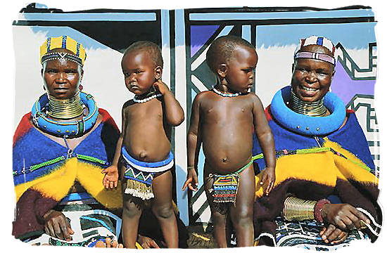
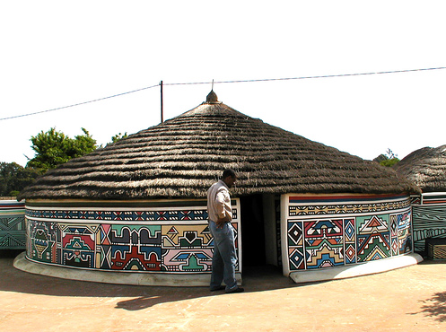
I have found a tribe which has a very strong graphical style to there decoration and fashion. the Ndebele tribe live around the Limpopo and while I do not know if they would gather marula fruit I do not think that matters because I'm trying to tie the product in with local South African culture.

A quick note, I think that it would be fitting to use several styles in my piece as South Africa has a vast amount of religions, cultures and ethnic groups.
The Ndebele decorate there houses with bold geometric patters which have a while background and strong blocks of colour and strong black lines. The painting and the design of the houses is left for the women and represents identity, values, emotions and personal expression but they never show religion and ritual.


Samson Mudzunga is a South African artist who lives and works in Limpopo. he creates massive versions of drums. "In the forms and imagery of these drums Mudzunga incorporates symbolism from the mythology and traditional customs of the Limpopo people to both explore these customs and question issues of power, in particular the power relationships existing within his own community." some of his latest work can be seen here.


Avhashoni Maingane is another artist from Limpopo his work is "linked to the dominant matriarchal presence in many black cultures". he tries to create awareness and education for arts in Limpopo.


I like the style of this last image and I think I could use something similar for representing the savannah landscape of the Kruger national park which I mentioned earlier.

I have just noticed that there are differences between the websites based on what location you choose that you live in. I will look at the key differences between the UK, USA and South African ones in another blog post.

top