I went to Sainsbury's last night and spent some time in the Spirits section looking at the bottles seeing if anything jumped out at me. I was expecting that there one be one bottle that I would see and think would be perfect, but there was nothing that I felt was really great. There where however several product which I felt I could probably do something with. those brands where,
- Monkey Shoulder
- Yamazaki
- Jagamister
- Amarula
- Sheridan
- Taylors
- Black Grouse
- Blackfriars dry gin
- Gabriel Boudier
- Beefeater
- Hendricks gin
- Highland Park
I'm going to take a look at each of these brands and look at some of the existing advertising for them and them hopefully pick one of them to produce my advert on.

this bottle stood out to me because of its very traditional bottle shape and pirate styling. I also liked the embossed metal monkeys on the shoulder of the bottle.
looking at there website they have a strong brand identity. they use bamboo and jungles a lot alongside monkeys. from the looks of there website the product is aimed at males probably 30-40 years of age. I say this from the cult styling on some of the monkeys and the language used in there descriptions of the product.
this could be quite a good product to animate for as they already use lots of silhouette and vector images. their aged styling on certain elements of the brand would also fit the handmade brief. the website also comes with a sound track which I could used to inspire the music which I will use for the project.

when I saw the packaging for Yamazaki Single Malt Whisky I liked its simplicity and felt that I could make a good animation on traditional Japanese craft and values. it is a very quiet brand and reminds me lots of The Japanese Tea Ceremony. the website uses lots of textures and is very small and understated.

(click image for a large version)
At first I did not like the Jagermeister bottle as I felt it was to clinical and was not sure what I could do with it. but it is a strong brand and there is a lot of potential for different styles with this product and it would give me a lot of freedom. the brand is also aligned with party lifestyle and live music which would give me good inspiration for music and styling.
there website is an animated flash website which has some great sinister location for the pages and a good styling. the stag in the logo is based off the legend of Saint Hubertus who while hunting was converted when he saw an image of the crucifix between at stags antlers, this would be quite a cool think to animate or to base an animation off.
here is an existing advert which uses live events and gives a sense of exclusivity.

when I saw this bottle I really liked the elephant which is on the bottle and its another product that I think would work well for the style of advert which the brief is asking for. the website makes strong use of it being a traditional African product but it is presented in the form of colonial rule in Africa.
The website makes heavy use imagery of elephants and African savannah. there is a clear brand identity that included music and stories which I could use for inspiration. I think the colours that I could use for this product would be great in an animated advert.
here are some TV adverts which show how they currently represent the brand.
Sheridan
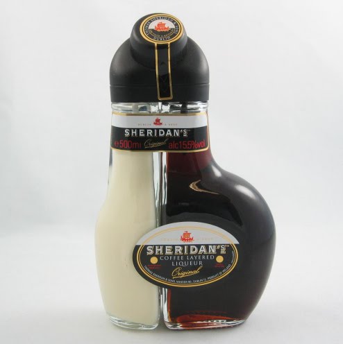
what I liked about this product was clearly the two colours of liqueur in the bottle which got me thinking that I could do some form of clever two tone animation.
when I looked for adverts and a website I could not find anything. I think that having the resources that the websites make available will be invaluable when it comes to picking apart the product and generating an idea. so for that reason I will take Sheridan's off my list of possible product.

the elegant and simple bottle caught my attention here. to me the product just looks like its full of quality and richness.
The website promotes Taylors as a prestigious and quality brand calling it's site "The home of port" which is probably quite a justified statement. the port comes from the very place where post was created and dates back 300 years to when port was first made. this kind of heritage would be great to show in an advert. the strength of the product means that they do not need to use conventional advertising. this means if I where to create an advert for this product I could make something unusual and out of the box that would be meant to be a talking point rather than a hard sell extrovert commercial.

what drew me to this product was not the bottle its self but the brand. This is the 'cousin' of the well know Scottish whisky The Famous Grouse who have some great simple television adverts. i think it would be fun to subvert these adverts for this product, this has already been done by the company though
the website show a dark Scottish landscape with a thunder storm above giving it a moody feeling which would be good inspiration for my advert.
Blackfriars dry gin

This bottle caught my eye because of the typefaces that it uses. I was thinking that this would allow me to create something in a different style to what I normally produce. what I did not notice however, which shows how good the packaging is, is that this is a Sainsbury's own brand product in the Taste the Difference range. This means that this would probably not get any stand alone advertising and would probably be difficult to create a realistic response for this product.

The incredibly label of this bottle and the deep colour of the liqueur inside is what caught my eye in this product. there is a great colour pallet and shapes which I could use in my advert if I choose this product. the label is the same original label which was creating in 1874.
Gabriel Boudier is not actually the product name, like I thought, it is the brand name. the product is called Creme De Cassis De Dijon. It took me a while to find out but the product is Blackcurrant liqueur.
the website promotes a traditional quality product and range of essential bartender items. mixing the various liqueurs seem a key part of the brand as that is what most of the products are used for, this would allow me to create an animation centred around luxury food & drinks and making the liqueur a key part of that. history is a strong part of the brand identity, the awards page of the website displays awards which the company won as far back as 1883.

This is another bottle which caught my attention because of the strong traditions associated with it. I think there is a lot here for me to work with to produce an animation for the handmade brief.
The website currently has a paper collage style which would work well with the handmade brief. it has quite a clean appearance with strong use of subtle shadows and textures. the site promotes gin as a young trendy drink to and the home page focuses on enjoying beefeater gin within London. the site has a section on history but it is brief and gives the impression of the company changing hands lots .
you can see from the video below, a promotion video made to be displayed during live events for Beefeater's Londonize advertising campaign, that Beefeater is clearly aiming at that young target audience
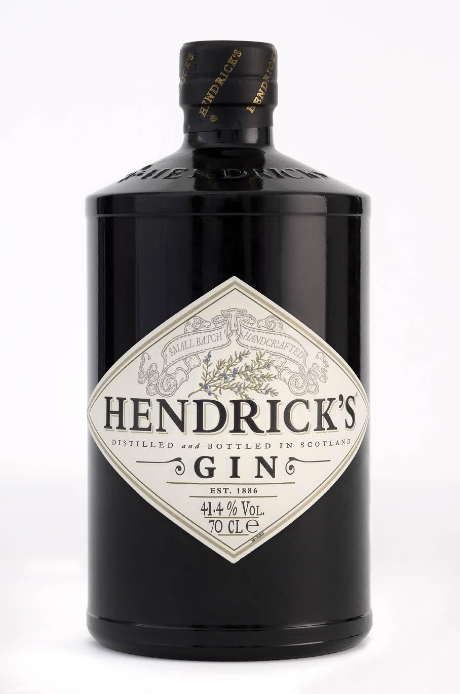
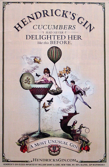
The shape and black colour of this bottle are what caught my eye in the super market. i also like the strong typography and the sparse use of words.
there website is great. they have a really strong visual style and brand identity. the styling reminds me of Monty Python by Terry Gilliam. the website is full of little animations and odd creations. the brand is very playful its its appearance but the when it talks about its product it is worded with in an information and prideful manner for the unique aspects used in its production. These USP's would give me something good to sell in an advert. I also think the styling is great for an advert and I could make something very different to what I would normally make. The website comes with music but it more like bar sounds than any particular song, however the style of music that is there and the music I have seen in there promotional videos is very popular to remix at the moment, see here. they have a strong presence in the uk festival scene to promote there brands making things such as the 'Horseless carriage'
here is a poster that shows how there styling looks,
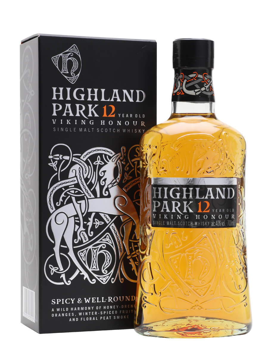
is the brand which my tutor suggested. the typography that we talked about I think is great having seen it for myself.
The website puts a strong focus on traditions and the heritage. it talks about its product as "The best spirit in the world". the styling of the website borrows lots from traditional Celtic style and colours which I could use for inspiration for my advert. the use of different typefaces is not replicated on the website and I feel the website was created separately from the branding as it dose not give off the same elegant and trust worth brand image.
0 comments:
Post a Comment